

To reduce the “surprise cost” moment during checkout, I designed a new cart component to communicate order thresholds earlier in the browsing experience. The cart, now, also shows how much more the user needs to add to unlock benefits like free delivery.
By showing users how far they are from free delivery or avoiding extra fees, the system reduces checkout surprises and helps users complete their purchase with more confidence.
But why did I invest in this when it seemed like the checout process was already solved? Well..
Objective
Delivery fees, small-cart charges, handling charges etc, even though they are crucial for the business, often appear late in Blinkit’s checkout flow, creating a “surprise cost” moment for users.
This minor project explores how introducing cost transparency earlier in the browsing experience can reduce friction, improve trust, and help users complete their orders more confidently.
Current Flow
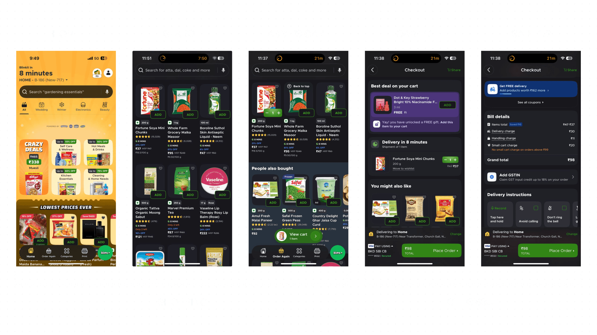
What's working well in the current flow?
Before identifying opportunities for improvement, it’s important to acknowledge several aspects of Blinkit’s experience that work effectively.
Clear Navigation & Familiar Patterns
The interface follows patterns commonly used across quick-commerce apps like Swiggy Instamart and Zepto. This familiarity reduces the learning curve and allows users to quickly understand how to browse, add items, and proceed to checkout.
UX Principle:
Jacob's Law
High Visibility of Key Information
Important information such as delivery time, discounts, and ratings is visible directly on product cards. This allows users to make quick decisions without needing to open the product detail page.
UX Principle:
Consistency and Standards
Persistent Cart Access
The floating “View Cart” CTA provides constant visibility of the cart state and enables users to quickly access checkout from anywhere in the browsing flow.
UX Principle:
Flexibility and Efficiency of Use
Problem Discovery
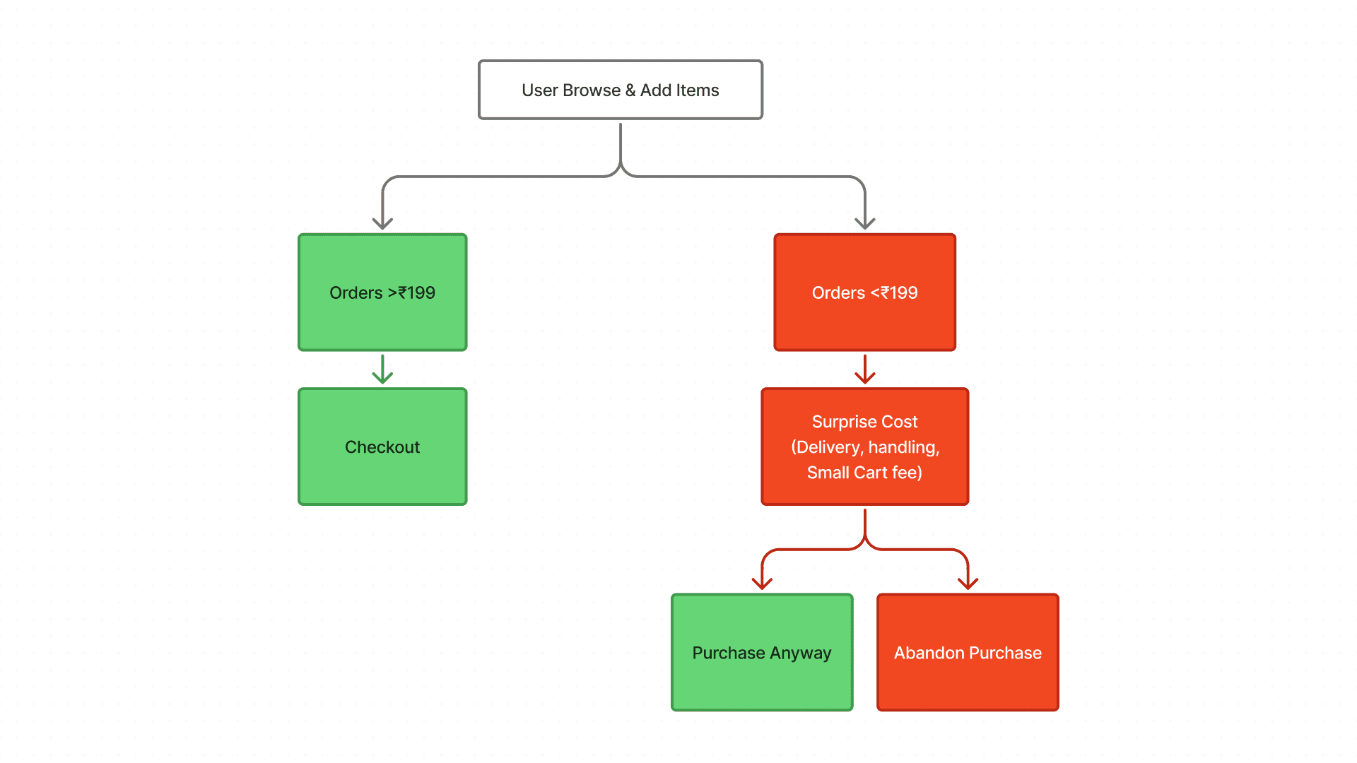
In quick-commerce apps, many smaller orders tend to be refill purchases i.e. items users need quickly rather than part of a planned grocery run. In such situations, users are often focused on speed and convenience, quickly adding items and proceeding toward checkout.
Because of this fast decision-making process, users may rely on rough mental estimates of their cart value rather than carefully calculating the final price.
When additional charges appear at checkout for orders below the minimum threshold, the sudden increase can feel unexpected and interrupt the purchase flow.
How are we gonna solve it?

Hypothesis (imp)
If Blinkit surfaces minimum order thresholds and potential extra charges earlier, users will better understand the true cost of their order and complete checkout with fewer surprises.
Users often rely on rough mental estimates while adding items. When extra fees appear suddenly at checkout, the mismatch between expected and final price creates a “surprise cost” moment.
If the system clearly shows how much more is needed to avoid extra charges or unlock free delivery, users may add one or two items to reach the threshold.
Design Exploration
Two Solutions:
Introduce Cost Transparency Earlier
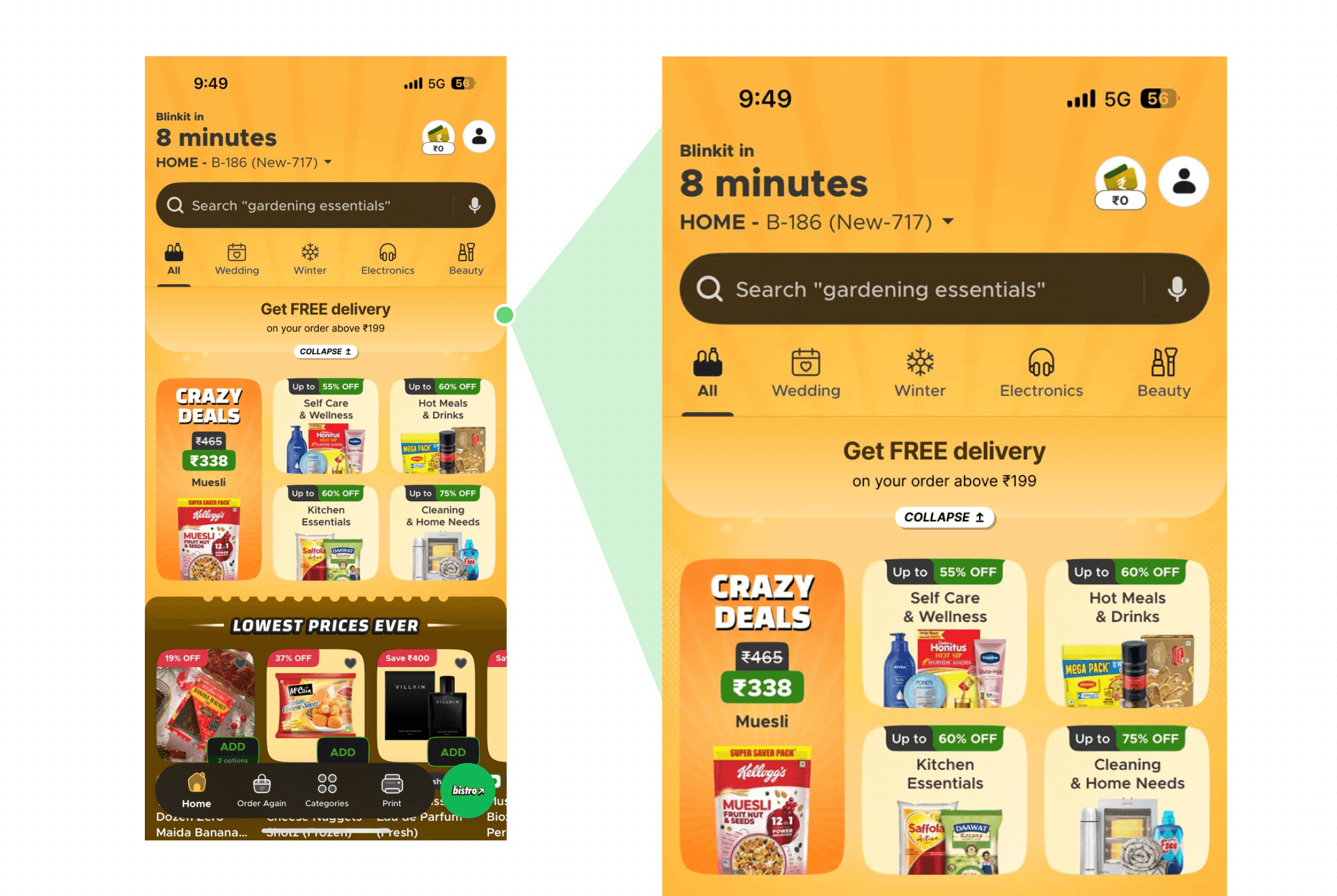
One reason users experience surprise costs is that order thresholds and extra charges are introduced late in the checkout flow.
To address this, the design surfaces minimum order incentives earlier in the browsing experience. A lightweight banner highlights the free delivery threshold directly on the home screen.
This ensures users are aware of the requirement before they begin adding items to the cart, helping them mentally plan their purchase.
UX Principle:
Recognition over recall
Provide Real-Time Cart Feedback

While browsing, the new cart component now communicates how far the user is from unlocking no small cart fee, free delivery, and so on.
The floating cart bar dynamically displays:
Current cart value
Remaining amount needed for free delivery
A clear call-to-action to view the cart
This transforms the cart from a passive indicator into an assistive decision tool.
UX Principle:
Flexibility & efficiency of use
How does it impact the business?
Success Metrics / KPIs
If this design were implemented, the following metrics could be used to evaluate its impact.
Checkout Completion Rate
Average Order Value (AOV)
Threshold Completion Rate
Cart Abandonment Rate
Work In Progress. More to come.
Handcrafted with 🧡 by Brijesh.